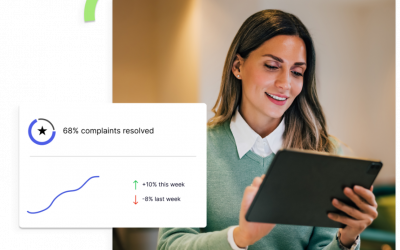
If you feel like you see infographics all the time on social media, in emails, and when conducting an online search, you’re not imagining things – you probably are. Infographics are super popular for one reason: they are visual, and we are visual learners.
As humans, we love visuals. In fact, we are hard-wired to choose visuals over text. Think cavemen were reading hieroglyphics on the cave wall to find dinner? Nope, they were out searching for it – while staying alert to danger.
Fast forward a few millennia, and we now are addicted to Pinterest, Instagram, videos, and infographics.
Of course, marketers use infographics to easily share their messages, but how often do you use infographics to tell the ongoing story of your workforce? Not often, and there’s a reason. As soon as you create them, they can become stale. This is where a fluid workforce analytics program excels.
But I’m getting ahead of myself. Consider these statistics:
- People following directions with text and illustrations do 323% better than people following directions without illustrations.
- Eye-tracking studies show internet readers pay close attention to information-carrying images. In fact, when the images are relevant, readers spend more time looking at the images than they do reading text on the page.
- Researchers found that colored visuals increase people’s willingness to read a piece of content by 80%.
- When people hear information, they’re likely to remember only 10% of that information three days later. However, if a relevant image is paired with that same information, people retained 65% of the information three days later.
Of course, infographics are only as useful and meaningful as the data sources they’re based on. They require content and knowledge: time frames, statistics, references, facts, and deductions.
And that’s where your workforce analytics platform comes into play. It’s already compiling solid data every day, so why not use it to feed live data into an infographic-like presentation?
The possible uses of that presentation are endless:
- Quarterly reports to your investors or advisory board
- “State of the workforce” overview
- Business projections on where the company is going or could go
- Proposals for organizational impact and change
Of course, it is much easier to compile an infographic-like presentation if the workforce analytics platform you use presents data on a dynamic, real-time, visual dashboard that already tells a story for you. We designed ZeroedIn to do just that. Contact us to set up your demo today.
Statistics courtesy of HubSpot.
Copyright: mpfphotography / 123RF Stock Photo


